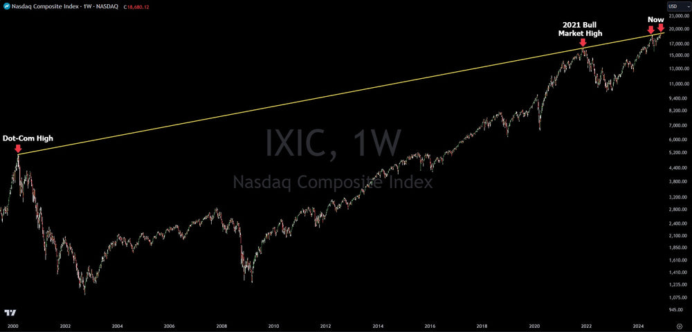
NASDAQ Logarithmic Chart Testing Major Resistance From Dot-Com Era

The Nasdaq pulled back in the last week, dropping as worries over inflation and tariffs brought up concerns of stagflation. Interestingly, the NASDAQ is at major resistance per the logarithmic (log) chart.
What is the logarithmic (log) chart? A logarithmic chart shows a chart growing as a percentage vs a dollar amount. This helps when looking at long time frames on a a chart. For example, looking at a log chart over 20, 50 or 100 years is likely better when analyzing it, vs a regular chart.
The log chart of the NASDAQ has a trend line that connects from the high of the Dot-Com bubble to the high of the bull market in 2021 and extends to recent highs. This should be a concern for investors as it signals significant resistance.
Level the playing field. Verified Investing provides everyday investors with the sophisticated tools and data-driven insights needed to succeed in today's market. Make informed decisions with confidence.
Trading involves substantial risk. All content is for educational purposes only and should not be considered financial advice or recommendations to buy or sell any asset. Read full terms of service.


