My Trading Game Plan Revealed - 10/21/2025: CPI Watch Ahead as Tech and Semiconductors Face Major Resistance

The market is at a fascinating decision point. The S&P 500 clings to a critical trendline after a light-volume rally, while the technology sector, the engine of this year's advance, is flashing significant warning signs. Meanwhile, precious metals are experiencing a dramatic pullback, and traders are looking ahead to a pivotal CPI report just days before the next Federal Reserve decision. In this morning’s My Trading Game Plan, Gareth Soloway, Chief Market Strategist at Verified Investing, dissected these conflicting signals and laid out a technical roadmap for what comes next.
Questioning the Narrative: A Look at the Upcoming CPI Data
Before diving into the charts, it's crucial to address a macroeconomic observation that could have profound market implications. This Friday, we get the latest Consumer Price Index (CPI) data, a key inflation metric that will heavily influence the Federal Reserve's upcoming interest rate decision. Gareth raised a critical point about the timing and potential nature of this release.
"Last time, five, six days before the Fed decision, they released an initial claims report… That was surprisingly, shockingly high… And then lo and behold, as soon as the Fed lowered rates by 25 basis points, then the numbers came right back down."
This precedent leads to a compelling theory: the CPI data on Friday might come in surprisingly low, painting a picture of cooling inflation. Why? Because it arrives just five days before the Fed's decision, and a "good" number could be used to pressure the central bank into a more aggressive 50 basis point rate cut. This isn't a conspiracy theory; it's an observation based on pattern recognition in data releases surrounding major policy events. For traders, this means being prepared for a potentially market-moving number on Friday that could be designed to influence policy, and understanding the context behind the headline figure is paramount.
A Tale of Two Indices and a Brewing Rotation
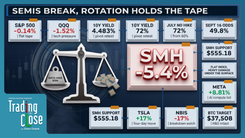
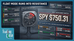
A clear divergence is emerging between the broad market and its tech-heavy counterpart. The S&P 500 chart shows the index closed yesterday’s session on or just fractionally above its key uptrend line. While the close is ambiguous, it keeps the bullish case alive. Even so, the upside appears limited, with the next major resistance zone just above 6,800, representing a mere 1% potential gain.
The NASDAQ 100 (QQQ), however, tells a different story. The tech index’s ascent was far more vertical, making a recapture of its trendline significantly more difficult. In fact, the QQQ would need to print a new all-time high just to tag that resistance level, where it would also meet a shorter-term trendline, creating a powerful confluence of resistance.
This technical divergence is likely the result of a subtle but important market rotation. As Gareth explained, institutional money managers are paid to stay invested. When they feel a sector like technology is overextended, they don't typically flee to cash; they rotate into other areas. We are seeing early evidence of this shift.
"You're starting to see names like Pfizer turning back up… You look at even names like KDP right here at Dr. Pepper starting to turn up beautifully after being hammered down. These more defensive names, including today, we had Coca-Cola reporting earnings and they did very, very well."
This rotation into defensive, value-oriented names helps support the S&P 500, which has a broader composition of 500 stocks, while the NASDAQ, which is heavily dominated by a handful of mega-cap tech names, feels the pressure more acutely. This is a critical dynamic for investors to understand as it could dictate market leadership into year-end.
The Semiconductor Wall of Resistance
If there is one chart that encapsulates the current market risk, it's the VanEck Semiconductor ETF (SMH). The AI trade, driven by semiconductors, has been the undeniable leader of this bull market. Now, the SMH is running into a level of technical resistance that is nothing short of epic.
By drawing a simple trendline connecting the COVID low to subsequent pivot points, and then creating a parallel of that line, an incredible pattern of order emerges from the perceived chaos of the market. This parallel line perfectly connects the 2024 high with the current highs, identifying a precise resistance zone.
To verify the significance of this trendline, Gareth demonstrated how dragging the parallel to other points on the chart reveals its importance. The parallel line aligns perfectly with multiple pivot points, both as support and resistance, throughout the last few years.
"That right there tells me that this trend line is likely. In other words, the market has order within the perceived chaos… this adds to the credence that this should be major resistance on the SMH."
This multi-year resistance channel suggests that the engine of the market rally is approaching a potential ceiling. A rejection here could have ripple effects across the entire technology sector and the broader market.
The Professional Mindset: Trading with Probabilities
The analysis of the SMH chart provides a perfect window into the methodology of a professional trader. It’s not about being certain; it’s about stacking probabilities in your favor.
"The charts are all based on probability. And so by getting enough things in alignment, you raise your odds of success… let's say, to 70, 75 percent. But you're never going to get to 100. Don't fool yourself."
This is the core difference between professional analysis and the retail mindset, which often seeks "no-brainer" trades. Acknowledging that even the best setups can fail is what enforces disciplined risk management. It’s why a seasoned trader never goes "all in" on a single position. The only way one would do that is with illegal insider information. For the rest of us, relying on a probabilistic approach derived from technical analysis is the only path to long-term consistency.
Decoding the Bond Market’s Trajectory
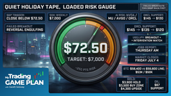
The 10-year Treasury yield continues its descent, currently trading around 3.959% after confirming a weekly breakdown below a major trendline. The question now is, how low can it go? Technical analysis provides a clear roadmap.
The first level of support sits around 3.85%, a level defined by connecting previous pivot lows. A bounce from this area would be expected, perhaps catalyzed by the Fed's announcement next week.
However, the more significant, longer-term target lies much lower. By drawing a parallel channel connecting the major highs on the 10-year yield chart, the lower boundary points to a powerful confluence zone around 3.4%. What makes this level so compelling? It aligns perfectly with a major pivot area from the prior uptrend. This "two-factor" support level at 3.4% is the major downside target traders should be watching in the bond market.
Gold's 1979 Echo and Today's Reality
Precious metals are seeing a significant sell-off today, a development that aligns perfectly with a historical pattern Gareth has been tracking. The price action in gold in 2025 has been eerily similar to its setup from 1979.
In both instances, gold saw a strong up-move, followed by a sideways consolidation, and then an explosive rally lasting exactly nine consecutive weeks. Today, just as in 1979, gold is beginning a sharp pullback after that nine-week surge.
However, context is everything. While the pattern is replicating, the fundamental backdrop is vastly different.
"The difference here is in 1979, it corrected 71%. I think at most, you're going to get a 15, 20% correction. The reason is in 1979, Volcker was raising interest rates to combat inflation. Instead, what are we doing here? Lowering rates."
Furthermore, the U.S. debt-to-GDP ratio was 32% in 1979; today, it stands at 130%. These factors suggest that while a healthy and necessary pullback is underway—potentially to the $3,500 USD to $3,600 USD range—it will not be the catastrophic collapse seen four decades ago. For long-term bulls, this correction represents a potential buying opportunity.
Silver is also painting a technically beautiful picture, with a sharp rejection from the upper parallel trendline identified last week. A pullback toward the $40 USD level would present a significant area of interest for buyers.
Conclusion: Navigating an Inflection Point with Clarity
The market is sending a complex mix of signals. The S&P 500 is holding its ground, supported by a rotation into defensive names, while the technology sector and its semiconductor leadership are facing a formidable wall of resistance. Bitcoin has been rejected from its "scene of the crime" retrace, and precious metals have begun a historically significant, and healthy, correction.
Amid this uncertainty, the principles of technical, probability-based analysis provide a clear framework. By identifying key levels, understanding intermarket relationships, and maintaining disciplined risk management, traders can navigate this environment with confidence. The charts are telling a story of potential change, and as Gareth reminds us, listening to them is far more effective than getting caught up in the hype and narratives of mainstream media.
Trading involves substantial risk. All content is for educational purposes only and should not be considered financial advice or recommendations to buy or sell any asset. Read full terms of service.