TRADING GAME PLAN REVEALED: 09/24/2025

In a market saturated with social media hype and mainstream media narratives, the disciplined trader seeks clarity over noise. This core philosophy—no BS, just charts—is the foundation of the TRADING GAME PLAN REVEALED show. In this morning's broadcast, Gareth Soloway, Chief Market Strategist at Verified Investing, cut through the distractions to reveal a confluence of technical patterns, fundamental warnings, and questionable corporate actions that suggest the market is at a critical inflection point.
As Gareth explained, his 26 years of experience have taught him a crucial lesson: "When I listen to that [hype], I usually lose. When I focus on the charts, they give me a probability based assessment, and then I can make an educated high probability decision and generally I'll make money." Today, that probability-based assessment is flashing caution signs that every investor needs to understand.
Powell's Sobering Message Finally Sinks In
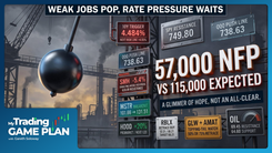
Yesterday's market decline was not random; it was a direct reaction to a speech by Federal Reserve Chairman Jerome Powell. His message was stark and multifaceted, hitting on points that bulls have conveniently ignored. First, he explicitly stated that equity prices are "extremely high" and are actively "contributing to inflation." This is a significant statement. When the head of the central bank directly links asset prices to the inflation problem they are trying to solve, it puts a target on the market's back.
Second, Powell highlighted the Fed's difficult position regarding the weakening labor market. He painted a picture with no easy exit: cut rates to support the economy and risk reigniting inflation, or hold rates steady and watch the labor market spiral into a recession. This sentiment, first voiced at last week's Fed decision, was initially brushed aside by the market. However, Powell's reiteration yesterday forced investors to confront the uncomfortable reality that the path forward is fraught with peril. The market can only ignore the Fed for so long, and yesterday's sell-off indicates that Powell's warnings are beginning to resonate.
The NVIDIA Question: A House of Cards?
While the Fed's stance presents a macroeconomic headwind, a more specific and potentially troubling story is unfolding within the market's darling, NVIDIA. The company recently announced it would invest up to $100 billion USD in OpenAI. While the stock initially rallied, the details of this arrangement raise serious questions about the true nature of AI-driven demand.
Gareth pointed out the glaring circular logic: "Nvidia is investing a hundred billion. Let's say they do the a hundred billion in open AI. So open AI can turn around and buy Nvidia chips. That doesn't seem kosher to me, right? There's something wrong there."
This arrangement has the appearance of a company financing its own demand. If the backlog for NVIDIA's chips is as robust as reported, why is there a need to fund a customer to the tune of $100 billion USD so they can purchase those very chips? This action could be interpreted as a signal that organic demand is not as strong as the narrative suggests. It creates a synthetic loop where investment dollars are recycled back as revenue, potentially inflating growth metrics and misleading investors about the health of the end market.
Furthermore, the "up to" language is a classic example of fine print that investors must scrutinize. NVIDIA could invest a nominal amount and still fulfill the headline, but the market has priced in the full potential. This situation serves as a critical reminder for investors to look beyond the headlines and question the substance of corporate announcements, especially when they seem too good to be true.
A Historical Echo: The S&P 500's Six-Month Cycle
One of the most compelling pieces of technical evidence for an impending correction comes from a historical pattern, or fractal, in the S&P 500. By analyzing past market cycles, we can identify recurring patterns in price and time. The current market structure bears an uncanny resemblance to the recovery following the COVID collapse.
Here's the breakdown:
- The COVID Pattern: After the 35.45% collapse in 2020, the S&P 500 staged a powerful recovery. That rally was precisely 1.8 times the size of the drop and, critically, it took exactly six months to complete. Following that six-month, 1.8x rally, the market experienced a sharp 10.5% correction.
- The Current Pattern: The "Liberation Day" drop was a 21% decline. If we apply the same multiple, 1.8 times that drop, we get the exact rally the S&P 500 has just experienced. What makes this parallel so astounding is the time component: this rally has also taken exactly six months.
As Gareth noted, "that my friends is interesting to me." When price and time align so perfectly with a recent historical precedent, technicians must pay close attention. This fractal analysis doesn't guarantee an identical outcome, but it strongly implies that a corrective phase is due. Based on this pattern, a 5% to 10% pullback in the near term, likely coming into October, is a high-probability expectation.
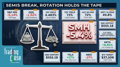
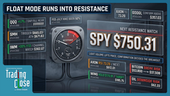
The NASDAQ's Wall of Resistance
While the S&P 500's fractal is based on time and price, the NASDAQ 100 is facing a more traditional, yet equally powerful, form of technical resistance. A trend line drawn from the COVID lows, which has acted as both support and resistance at multiple key pivots, is once again being tested from the underside.
History shows that rejections from this trend line have been severe:
- The first pullback from this line was a 16% decline.
- The second pullback was a 25% decline.
The NASDAQ has just hit this formidable barrier again. Given the magnitude of the previous corrections from this exact level, it raises the question of whether the market is setting up for another significant drawdown, potentially in the 15% to 25% range. Since the NASDAQ and the AI trade have been the primary drivers of this year's rally, weakness in this index could have an outsized impact on broader market sentiment.
The Smoke is Building: Topping Tails and Yield Anomalies
Beyond the major indices, signs of exhaustion are appearing across key economic bellwethers. One of the most telling signals is the proliferation of "topping tails," a bearish candlestick pattern that indicates a reversal where buyers initially pushed prices higher during the day, only for sellers to take control and force a close near the lows.
These warning signs are not isolated. They are appearing in charts that represent the core of the economy:
- The Dow Jones Industrial Average: A clear topping tail formed yesterday, signaling a potential breakdown from its tightening wedge pattern.
- Caterpillar (CAT): A proxy for global industrial and economic demand, Caterpillar slammed into a key trend line and printed a prominent topping tail.
- Goldman Sachs (GS): A leader in the financial sector, Goldman Sachs also hit trend line resistance and reversed with a topping tail.
This pattern of reversals across industrials, financials, and the broader Dow Jones suggests that weakness is spreading beneath the surface. As Gareth puts it, "It's starting to look at the smoke building. Is there a fire here now?"
Compounding these concerns is the anomalous behavior in the bond and currency markets. Despite the Federal Reserve cutting rates, the 10-Year Treasury yield and the US Dollar are both pushing higher. This is a significant red flag. Typically, rate cuts would weaken the dollar and lower yields. The opposite action suggests that the market either fears inflation will force the Fed's hand, or that foreign buyers are demanding higher interest rates to compensate for the risk of holding US debt. Either scenario is a headwind for equities.
Debunking the Bullish Narrative: The Myth of Sideline Cash
One of the most persistent bullish arguments is the idea that there is "$7.5 trillion in money markets" ready to flood into stocks. While the number sounds enormous, it is a misleading statistic when viewed without context.
As Gareth explained, this narrative is a classic case of ignoring the denominator. The total market capitalization of the stock market is vastly larger than it was in previous cycles.
- In the dot-com era or pre-2008, there may have been only $1 trillion or $2 trillion USD in money markets. However, relative to the much smaller total market cap of that time, it represented a larger percentage of potential buying power.
- Today, the market cap of just three companies—Apple, Microsoft, and NVIDIA—is over $8 trillion USD. The entire $7.5 trillion USD on the sidelines would not be enough to meaningfully move the needle if it were to enter the market.
"When you read these headlines, what does it do? It makes the retail investor get really bullish... Got to look at the fine print guys." This critical analysis reveals that the "cash on the sidelines" argument is far weaker than the headline suggests, removing a key pillar of support for the bullish case.
Conclusion: A Time for Prudence and Risk Assessment
The market has demonstrated incredible resilience, but a growing body of evidence suggests a corrective phase may be imminent. From Jerome Powell's direct warnings and the questionable fundamentals of the NVIDIA story to the precise historical fractals in the S&P 500 and the wall of resistance facing the NASDAQ, the warning signs are clear. The proliferation of topping tails across key sectors and the anomalous strength in yields further underscore the mounting risks.
While the market could defy these signals and push higher, a disciplined, probability-based approach demands that we acknowledge this evidence. This is not a time for blind optimism fueled by misleading headlines. It is a time for careful risk assessment, for scrutinizing the fine print, and for trusting the objective data presented on the charts. The smoke is building, and prudent investors will be prepared in case it signals a fire.
Trading involves substantial risk. All content is for educational purposes only and should not be considered financial advice or recommendations to buy or sell any asset. Read full terms of service.